Our final project for the semester was to create business cards for ourselves and a postcard. I decided to make my main theme be music, with my career on my business cards being a producer. I tried to looking through Moo to find inspiration, but I couldn't find anything I liked in particular. So I came up with the idea to use a sine wave as my pattern and then use a mixing board for my photo. My process included using saturation and hues, and using gradients to create shadows. I also experimented with opacity and using different colors to create different moods. This tells my story that I love music and consider it an integral part of my life, and I wanted to express that with my graphic design.
This semester was about Convergence Journalism; writing and filming interviews, capturing b-roll, recording voiceovers, and then piecing all of these things together to create a news story were the thing that we learned and worked on these past couple of months. The projects that we completed were all certain topics that we had create a news package over, such as what someone did over the summer or what kind of hobbies they had, as well as live events such as the blood drive and the news packages we created for our ONW Now final.
Some key and memorable events that occurred during the semester were the hectic filming and creation of the blood drive video, and the occasional teamwork activities that we did that to strengthen our work ability. However, there were a few key issues, such as reaching deadlines and getting behind on projects. For example, the hobby video got severely delayed due to a mix of bad luck and mismanagement. However, I made sure to finish all of my work and put all of my effort into the videos. These elements strengthened my video experience and gave me a glimpse of the work I would need to do in the future.
An element that worked well with me was communication. I made sure that I was able to contact my partner on every project to share ideas and to make sure that we were on the same page. I don't believe there were any problems that came up that were due to poor communication. Another element that worked fine was the technical aspect of the program. I adhered to the 3 second rule and tried to include as many J and L edit as I could. I think my best example of this would be the swim video I did for the ONW Now Sophomore project. One element that didn't work so well was time management and planning, partly because slight mismanagement such as not scheduling things out in my agenda, but also due to constant misfortunes that I had trouble adjusting to. I resolved these issues by finding where I went wrong, and having to determination to not let it get in the way again.
I learned many new things during this semester. The entire concept of creating a news package, so just about everything we learned except for editing was new to me. This was also the first time we got to use the regular cameras, so learned how to record and adjust white balance and focus was also a new experience. I also feel that I improved on my communication and collaboration skills, by trying to make everything clear cut and giving myself the ability to reach out to my partners during the projects.
Next semester I will definitely work on my project management skills, and make sure that I have a fully written out schedule for what I need to do, and to plan ahead of time in case mishaps occur. I am looking forward to the entertainment aspect of A/V, and the various difference in not only work space but levels of creativity. I hope that I will enjoy it, and that I will be able to endure the challenges that it may bring.
The scope of the project was to create a personalized logo that represents who we are and follows to guidelines of logo design. Above are all of the concepts that I experimented with. I begun the process by sketching ideas in my notebook, and then recreate them on Illustrator and refine them. The logo that I settled on was the top left one, as I like the simplified design and only straight lines. One thing I would do the same is the experimentation and applying different typefaces and color schemes to achieve something that I enjoy. One thing I would do differently would be to make more revisions and make the line on my final logo thicker. Overall, I had a good time creating plenty of designs and feel that I understand the process of logo design better.
The scope of the project was to take landscape photos and make them look like paintings using the brush tools. My original was of some mountains by a river delta. Since I was having trouble getting the paintings to look exactly like the original, I decided to have some fun with it and make it look like a watercolor. Something I would do differently next time is to spend more time figuring what I did wrong, as I asked a lot of people and looking online and couldn't find much. What I did learn was how to create preset brushes and using the wet and dry to create and mix colors. Something I would do the same is color choice. Overall, I learned quite a bit from this project but I wish I could figure out what I am doing wrong on certain things.
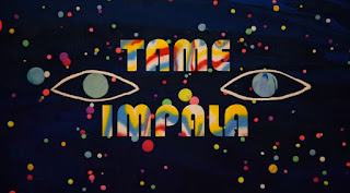
The scope of the masks project was to understand how masks work in Photoshop, how to appropriately use them, and then to be able to use pur creativity with the concept. For my original, I decided to do a clipping mask postcard based on Tame Impala, one of my favorite bands, and Alt-J, one of the bands to got me into music. I used artwork from the bands and went through many typefaces in order to find ones that fit the band's style. Through this project I learned how masks can be used for a variety of different things, and the techinical aspect of applying an image to the mask. Something I would to do differently would be to explore the other different kinds of masks. Something I would do the same would be to come up with ideas that relate to me more as a person. All and all, I had fun with this concept and still have more ideas on what to do with it, such as using shapes and constrasting images.
This article is about the essentialness of creative anarchy, and while breaking the roles is important, understanding those rules is necessary in order to break them. Creative anarchy, as the article states, is about knowing the boundaries of design, and knowing when it is necessary to stretch those boundaries. The article argues that creative anarchy is important during all graphic design projects, but the importance varies depending on the project. The author supports this argument by explaining how rules are simply guidelines, and by bending these guidelines at the right level and in the right way, the more effective your design can be, with examples such as the Candie's shoe ad. The strengths of the article is that it makes it points concise and clear and shows clearly how to bend the rules, but its weaknesses are that it is not clear on what the rules actually are, and there is not much evidence used. I felt that if the actual rules were addressed, the idea would come across better without major questions. As for the evidence, the lack thereof muddies up the supports of the argument. The argument itself, however, is well construed as well as the process, making clear when it is appropriate to stretch the boundaries. Overall, it delivers the message well but I feel it doesn't back it up well.
2. Film more B-Roll, end with a quote Nick:1. Titles bars were good 2. Audio levels need adjusting Allison:1. Meaningful interviews 2. Voice overs overlap/overrun soundbytes Courtney:1. Well developed voice overs 2. More variety in interviews Dema:1. Enthusiasm in voice overs 2. More steady camera shots Rosie:1. Good B-Roll variety 2. More meaningful interview soundbytes Kierstyn:1. Well set up shots 2. Better soundbyte editing Rylee:1. Story-driven voice overs 2. Missing title bars Catherine:1. Meaningful interviews 2. Interview soundbytes are too long Alex:1. Well shot B-Roll 2. Too many long pauses Mitch:1. Story driven voice overs 2. Interview and voice over overlap at one point Nicole:1. In-depth interviews 2. Incorrect use of L and J edits Drew:1. Most B-Roll follows rule of thirds 2. A few quick jumps Emily:1. Interesting B-Roll 2. Yellow tint (white balance the camera) Conlin:1. Even variety in B-Roll 2. More variety in interviews Cyle:1. Good variety in B-Roll 2. Interviewer's voice should not be in the soundbyte Jacob:1. Intriguing B-Roll 2. Audio levels need adjustment Delaney:1. N/A 2. N/A Abbey:1. Story driven voice overs 2. Incorrect use of L and J edits Amy:1. Well set-up lead 2. Voice overs could be stronger Chelsea:1. Story driven interviews 2. Interviews are hard to hear Alyssa:1. Different point of view 2. Framing during interviews could be better
Things that I learned from the critique session that I would apply to my future projects would be to adjust the audio levels so that everything is equalized in volume and is easy to hear. Another thing I will apply is to make sure my title bars are the correct theme and format. The rule of thirds is also something that I want to keep in mind for the next project.
This tutorial will show how to use the rotate options in order to create a radial pattern. The rotate options is frequently in the design world, and how to use it effectively is important.
1. Draw your desired shape using the shape tool. Make sure it is big enough for a pattern. Nearly any shape is suitable. Center it on the art board for recommended effect.
2. Copy and paste the shape and overlap it with original shape.
3. With the copied shape selected, go to Object>Transform>Rotate to access the rotate panel. With the rotate panel, enter the desired angle of rotation, for example, 25 degrees or simply 5 degrees. Use the Preview button on the lower left to help you find an ideal angle.
4. Copy and paste the rotated shape and overlap the copy over the first rotated shape.
5. Repeat steps 3 and 4 until you are satisfied with results.
6. Add something extra to the radial motif. Change the colors, use a gradient, adjust opacity, use the pathfinder tool or the shape building, or simply just experiment with other tools and option panels to create something that fits your style.
This work is the album cover to Tame Impala's latest album Currents, and is based on the scientific principle of vortex shedding, which is the particular way a liquid or gas moves around a solid object. It uses a purple and pink/yellow color scheme, reminiscent of the 70s & 80s eras of music. It represents a collision of classic 70s and classic 80s music in an electronic/synth fasion. One element I would take away from this album cover is the style of having a repeating pattern and creating something that interacts with that pattern in a way, which is an interesting design concept. One element of this that I have already learned is the smooth gradient applied to the neon stream. The creator did well with the overall execution of the streams, as it looks very natural. One thing I feel could have been done better was the shading on the silver ball/marble, because it does not look entirely correct shading wise. Overall, I thought it had a great design with a great execution.
Motif: The scope of the motif was to create radial pattern that would work for a ceiling tile. I came up with the idea while messing around with the rotate tool. I created it by drawing a star and rotating it by 5 degrees until it made a complete circle. I then copy and pasted that into the empty circle space and used the pathfinder tool to remove certain sections and create the above pattern. I thought this was fun because it was simple and easy to do while also having a wide range of possibilities.
Repeating Pattern: The scope of the repeating pattern was to create an interesting, solid color repeating pattern that would fit among others as a ceiling tile. I found the concept when researching different kind of designs online. I created in by placing four circles in a square and using estimate the correct amount of pucker and bloat to make the shape that was created by the circles meeting together. I then filled in the remaining spaces by the rectangles edge with the blue color. I thought this was enjoyable because it allowed me to find a design that appealed to me and recreate it using what I have learned in this class.
This article was about a Florida newspaper that was failing due to pumping out mediocre content for the purpose of filling up space. The paper decided to switch things up by focusing on major stories with better content and letting the newsroom experiment with journalism, which resulted in a happier newsroom and a higher quality newpaper. The author's argument is that by allowing more freedom to the reporters and valuing quality over quantity, a newspaper can become more interesting and brings joy to the journalists "... [due] to new opportunities to dig up enterprise stories and try out new ideas" (Nesmith). The strengths with the author's argument were that they were supported by anecdotes of the people who worked at the paper and who could give their experiences. A weakness of the article could be that it never acknowledge any possible opposition. Overall, the author wants a much more flexible newsroom. The author's arguments does support the main points of the article, because the success of the paper was convincingly contributed to the reasons the author's argument makes. The author explores additional reasons also, and shows how they might have helped to the success too. Being in Convergence Journalism, this applies because given more freedom and resources means more possiblities for us too. All in all, I believe the author provided a convincing argument that had great supporting anecdotes.
The video I chose was a short animated video about a lazy intergalactic delivery service. The general scope of the video was to portray a quick, dark, but funny short video. The story is about a how an incompetent delivery man land on a tiny planet, and unknowingly manages to bring terror to the planet and its inhabitants, and eventually disintegrates it. I decided to analyze the video through its cinematography. I thought it was fairly well made; although there were a lot of long and centered shots, it did also use the rule of thirds frequently and the long shots never felt drawn out or boring. For example, there is a scene where one of the aliens is running from a giant can, and while the shot goes on for quite some time, it does not entirely bore you by throwing little jokes here and there (although I agree that the team should have split it up into different shots). One element I might use from this video is the use of a wide shot to not set the scene, but to show the characteristics of characters, like the wide shot of the delivery man's messy ship. Something that I had already learned that I thought the video did well on was how to position the rule of thirds, by placing the subject on a line and having something interesting in every box. Overall, I believe the cinematography was pretty decent, was pleasant looking, but could use some improvement in adjusting shots and drawn-out shots.
For this project we had three sections to work on. The first section was to create a basic pencil using a tutorial sheet, as well as creating a can to put the pencil in, and it helped you learn how to create a basic object with basic shapes. The second section was to create another pencil, but have it personalized. My personalized pencil was colored in Royals colors and it was writing on a piece of paper. The last section had you create something of your own using shape tools and other useful tools in Illustrator. I decided to create a synthesizer using the mainly the shape tool and the text tool.
One of the main things I learned when doing the project was to always save frequently. At one point at this project, I forgot to save my progress, and right towards the end of class Illustrator unexpectedly crashed. Consequently, I had lost all of the work I had done that, which pushed me back progress-wise from the rest of the class. From that moment on, I try to save every time I make a major change, and I will try to make that a habit for later on in the year.
As for tools, I learned how to use the shape tool. For example, I learned that if you simply single click on the board, you have the option to input specific measurements for that shape. Also, if you hold the spacebar it locks the movement of the shape to a certain path. If you hold down the shift button when expanding the object, it locks to the original shape, allowing you to keep the same height and width. I also learned what the Live Bucket Tool is, which is a special kind of bucket that creates objects out of what's drawn, and then fills it in with a color.
Graphic design is the art of communicating through visual means, using text, shapes, and photos, among other things. It is at the simplest representing ideas in a visual form. Graphic design is everywhere in the world, from brands, adverts, and packaging to street signs and basic labels. The most successful graphic designs involve a memorable and relatable connection to the world, and portray a mood or concept that can be easily understood.
My favorite instances of graphic design would be album art. I very much enjoyed music, and I feel that the best album covers reinforce the tone of the album and can be easily associated with the music. They represent the emotions and atmosphere of the music into a visual format, and adds to the overall experience of the album.
The scope was to create a product that would appeal to consumers, starting up a company that would sell this product, and marketing it and creating a message and overall theme for the company. Our product was the Rainbow Generator, which was a machine that created rainbows with ease. The company we created in order to market and sell this product was Iris, Inc. The overall message of our company was to bring color into children's worlds, and to show them the beauty that is Earth. The partners that I worked with for this project were Madison Beck (ENFP), Ariana Caraway (ENFJ), and Elijah Harris (INTJ).
What was your process?
We started off the project by brainstorming about what our product should be. After a couple days of thinking and narrowing down our decisions, we finally all agreed on having the Rainbow Generator as our product. Once this was done, we had to create our company. We decided upon Iris, Inc., which represents the Greek goddess Iris, who summoned rainbows from the heavens.
The first rotation we had was animation. We first all put in our ideas on what the product would look like before settling on the final design, which is a large machine that resembles a water cooler. You insert water into the top compartment and press the button, which causes a rainbow to appear out of the hole. Maddi and Ariana worked on the final model of the product, Elijah worked on the animation showcase of the product, and I worked on the packaging of the product.
Our second rotation was graphic design/website. Our first goal was to create a logo. We all knew that we wanted a variety of colors for our brand to represent the rainbow part of our company, but we also wanted to find shades and hues of those colors that represented innocence and wonderment. I finally found a color scheme that we all believed represented that, which is shown above. We also wanted a simple logo, one that was easy to the eye. Maddi and Ariana came up with the design of the logo as well as the typeface. Next we had to design the website and coupon. I created the outline of the coupon, while Elijah created the majority of it. Maddi and Ariana worked on creating the website, which helped reinforce that idea of simplicity.
Our last rotation was video production. We had the difficulty of not being able to have a physical product in our commercial, so we decided to approach it by explaining the problems with creating rainbows the manual way, and describing how the Rainbow Generator can solve these problems. Maddi, Ariana, and Elijah did acting for the video, Elijah created the animation, and I filmed and edited the commercial.
What did you learn along the way?
Along the way I learned many things. I grasped a better understanding of using SketchUp, as previously I had little knowledge of how to use the product. I also learned small techniques in video editing that betters the overall end product, such as adjusting and mixing audio volume, adding titles and professional credits, and how to add effects to videos, like adjusting the speed. Professionally, I learned how to understand and work with a team that I knew little about before embarking on this project. I learned how to cooperate better with out people and how we all need to compromise to achieve a solid end product.
What would you do differently next time? What would you do the same?
Next time, I would probably try harder to become more involved with creative decisions and deciding the direction that the company is going in, as in this project I didn't feel the motivation to do that. Things I will probably do the same is continue being a source of logic for the team and compromise with other team members regarding important decisions.
What will you draw from this experience to enhance your next project?
I will bring an effort to work better with others and make our goals clearer before beginning to do a lot of work. I will also try to become more involved with the team, especially when making creative decisions that guide the direction of the project.
All in all, I enjoyed the project. I thought it was rather enjoyable and allowed to combine and use all the information and creative processes that we learned in this school year.
Our company's product was the Rainbow Generator, which is a rentable machine that creates rainbows at ease. We came up with the idea after several days of difficult brainstorming. It works by inserting water into the node, which then triggers a rainbow to flow out after a series of mechanisms inside of the machine. We soon then developed concept art of what it would look like, both in Illustrator and in Sketch-Up. After this we developed a website as well as a company logo to create a feel for the product and it delivers to the consumer. We found a color pallette that would fit with what the product evokes and means to the consumer. Then we created an advertisement, which is shown above. For the advertisement, we had to overcome the obsticule of not being able to have a physical model of our product. So instead of demonstrating its use, we decided to go for a more comedic/dramatic direction for the commercial.
What was the scope of the project?
The scope of the project was to create a full-scale model of a dream house that included details such as windows, porches, garages, and etc.
What was your process?
I began pre-production of this project by looking up many construction plans and selecting the one I liked the most. After choosing, I then wrote down major details of the house's plans, such as dimensions and sizes. During production I used Sketchup and its tools to create a 3D model according to the dimensions, and then added large details like the windows and the porch. In post-production, I made sure that all of the parts of the house fit together, and also added some fun compliment details, like a tree and a car.
What did you learn along the way?
Technically speaking, I learned about many different tools, such as the offset tool which allows you to create a copy of a shape at a different size, the measuring tape which allowed me to measure the length of lines and parts of the house, and the scenes tool which allows you to create an animated tour of whatever you are modeling.
What would you do different next time?
Next time, I will try to pay more attention to how to do certain things, because that limited me in this project. I will also try to focus a bit more on the project, so that I can end up next time with a much better result.
What would you do the same?
I will use the same method that I used to create the roof, as it was very simple and effective. I will also try to do my roof in the same style, as it is the easiest type of roof to do for a complicated structured house.
What will you draw from this experience to enhance your next project?
I will try to focus more on my end goal, and try to focus most if not all of my classtime on working towards that end goal and towards bettering my project. I will also try to be a bit more creative.
General Thoughts and Conclusions
I thought this project was very enjoyable, albeit challenging and difficult. I liked creating the house from scratch and making progress with each step. I also enjoyed some of the creative freedoms we were given in this project, such as the decorations.
The scope of this animation project was to create a short, 30 to 45 second animation using Keynote and iMovie. In pre-production, I came up with the idea to create a sequel to my beloved classic, and I created a storyboard as well as a couple of sketches to finalize my idea into something producible. As for production, I drew out each frame in Keynote, to make it as I planned in my storyboard, and I made sure that each frame made sense and that the animation was as good as it could get. When I was done with the basic story animation, I added in some other minor details such as a bird and a flower, and I also added in an intro title as well as end credits. Then I imported each frame from Keynote into iMovie and added in some sound effects and music.
What I learned from this project was how to navigate and use Keynote correctly in order to achieve the illusion of motion. I also learned how to work towards my deadlines, as well as my own personal guidelines. Next time, I would probably put more detail in my animations and tweak them more so that the main animation is as best as it could be. Something I would do the same is find ways to use the program to my advantage to achieve certain effects, such as the slow-mo fall. What I would draw from this experience is to try to be as efficient as I was in this project, as I was pretty efficient with getting my work done.