Showing posts with label Graphic Design. Show all posts

Wednesday, December 9, 2015

Mountain

Logo Blog Post


The scope of the project was to create a personalized logo that represents who we are and follows to guidelines of logo design. Above are all of the concepts that I experimented with. I begun the process by sketching ideas in my notebook, and then recreate them on Illustrator and refine them. The logo that I settled on was the top left one, as I like the simplified design and only straight lines. One thing I would do the same is the experimentation and applying different typefaces and color schemes to achieve something that I enjoy. One thing I would do differently would be to make more revisions and make the line on my final logo thicker. Overall, I had a good time creating plenty of designs and feel that I understand the process of logo design better.

Landscape Paintings


The scope of the project was to take landscape photos and make them look like paintings using the brush tools. My original was of some mountains by a river delta. Since I was having trouble getting the paintings to look exactly like the original, I decided to have some fun with it and make it look like a watercolor. Something I would do differently next time is to spend more time figuring what I did wrong, as I asked a lot of people and looking online and couldn't find much. What I did learn was how to create preset brushes and using the wet and dry to create and mix colors. Something  I would do the same is color choice. Overall, I learned quite a bit from this project but I wish I could figure out what I am doing wrong on certain things.

Tuesday, December 8, 2015

Clipping Masks


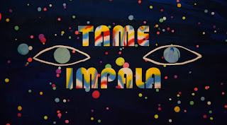
The scope of the masks project was to understand how masks work in Photoshop, how to appropriately use them, and then to be able to use pur creativity with the concept. For my original, I decided to do a clipping mask postcard based on Tame Impala, one of my favorite bands, and Alt-J, one of the bands to got me into music. I used artwork from the bands and went through many typefaces in order to find ones that fit the band's style. Through this project I learned how masks can be used for a variety of different things, and the techinical aspect of applying an image to the mask. Something I would to do differently would be to explore the other different kinds of masks. Something I would do the same would be to come up with ideas that relate to me more as a person. All and all, I had fun with this concept and still have more ideas on what to do with it, such as using shapes and constrasting images.

Sunday, December 6, 2015

Professional Article Review


This article is about the essentialness of creative anarchy, and while breaking the roles is important, understanding those rules is necessary in order to break them. Creative anarchy, as the article states, is about knowing the boundaries of design, and knowing when it is necessary to stretch those boundaries. The article argues that creative anarchy is important during all graphic design projects, but the importance varies depending on the project. The author supports this argument by explaining how rules are simply guidelines, and by bending these guidelines at the right level and in the right way, the more effective your design can be, with examples such as the Candie's shoe ad. The strengths of the article is that it makes it points concise and clear and shows clearly how to bend the rules, but its weaknesses are that it is not clear on what the rules actually are, and there is not much evidence used. I felt that if the actual rules were addressed, the idea would come across better without major questions. As for the evidence, the lack thereof muddies up the supports of the argument. The argument itself, however, is well construed as well as the process, making clear when it is appropriate to stretch the boundaries. Overall, it delivers the message well but I feel it doesn't back it up well.

Thursday, October 8, 2015

Tutorial Blog Post


This tutorial will show how to use the rotate options in order to create a radial pattern. The rotate options is frequently in the design world, and how to use it effectively is important.

1. Draw your desired shape using the shape tool. Make sure it is big enough for a pattern. Nearly any shape is suitable. Center it on the art board for recommended effect.

2. Copy and paste the shape and overlap it with original shape.

3. With the copied shape selected, go to Object>Transform>Rotate to access the rotate panel. With the rotate panel, enter the desired angle of rotation, for example, 25 degrees or simply 5 degrees. Use the Preview button on the lower left to help you find an ideal angle.

4. Copy and paste the rotated shape and overlap the copy over the first rotated shape.

5. Repeat steps 3 and 4 until you are satisfied with results.

6. Add something extra to the radial motif. Change the colors, use a gradient, adjust opacity, use the pathfinder tool or the shape building, or simply just experiment with other tools and option panels to create something that fits your style.


Professional Project Review


This work is the album cover to Tame Impala's latest album Currents, and is based on the scientific principle of vortex shedding, which is the particular way a liquid or gas moves around a solid object. It uses a purple and pink/yellow color scheme, reminiscent of the 70s & 80s eras of music. It represents a collision of classic 70s and classic 80s music in an electronic/synth fasion. One element I would take away from this album cover is the style of having a repeating pattern and creating something that interacts with that pattern in a way, which is an interesting design concept. One element of this that I have already learned is the smooth gradient applied to the neon stream. The creator did well with the overall execution of the streams, as it looks very natural. One thing I feel could have been done better was the shading on the silver ball/marble, because it does not look entirely correct shading wise. Overall, I thought it had a great design with a great execution.

Wednesday, October 7, 2015

Graphic Design Pattern


Motif:  The scope of the motif was to create radial pattern that would work for a ceiling tile. I came up with the idea while messing around with the rotate tool. I created it by drawing a star and rotating it by 5 degrees until it made a complete circle. I then copy and pasted that into the empty circle space and used the pathfinder tool to remove certain sections and create the above pattern. I thought this was fun because it was simple and easy to do while also having a wide range of possibilities.


Repeating Pattern: The scope of the repeating pattern was to create an interesting, solid color repeating pattern that would fit among others as a ceiling tile. I found the concept when researching different kind of designs online. I created in by placing four circles in a square and using estimate the correct amount of pucker and bloat to make the shape that was created by the circles meeting together. I then filled in the remaining spaces by the rectangles edge with the blue color. I thought this was enjoyable because it allowed me to find a design that appealed to me and recreate it using what I have learned in this class.

Tuesday, September 1, 2015

Graphic Design Pencil Project

For this project we had three sections to work on. The first section was to create a basic pencil using a tutorial sheet, as well as creating a can to put the pencil in, and it helped you learn how to create a basic object with basic shapes. The second section was to create another pencil, but have it personalized. My personalized pencil was colored in Royals colors and it was writing on a piece of paper. The last section had you create something of your own using shape tools and other useful tools in Illustrator. I decided to create a synthesizer using the mainly the shape tool and the text tool.

One of the main things I learned when doing the project was to always save frequently. At one point at this project, I forgot to save my progress, and right towards the end of class Illustrator unexpectedly crashed. Consequently, I had lost all of the work I had done that, which pushed me back progress-wise from the rest of the class. From that moment on, I try to save every time I make a major change, and I will try to make that a habit for later on in the year.

As for tools, I learned how to use the shape tool. For example, I learned that if you simply single click on the board, you have the option to input specific measurements for that shape. Also, if you hold the spacebar it locks the movement of the shape to a certain path. If you hold down the shift button when expanding the object, it locks to the original shape, allowing you to keep the same height and width. I also learned what the Live Bucket Tool is, which is a special kind of bucket that creates objects out of what's drawn, and then fills it in with a color.

Thursday, August 20, 2015

Graphic Design Paragraph

Graphic design is the art of communicating through visual means, using text, shapes, and photos, among other things. It is at the simplest representing ideas in a visual form. Graphic design is everywhere in the world, from brands, adverts, and packaging to street signs and basic labels. The most successful graphic designs involve a memorable and relatable connection to the world, and portray a mood or concept that can be easily understood.

My favorite instances of graphic design would be album art. I very much enjoyed music, and I feel that the best album covers reinforce the tone of the album and can be easily associated with the music. They represent the emotions and atmosphere of the music into a visual format, and adds to the overall experience of the album.
http://www.designtalkboard.com/design-articles/whats-design.shtml