Friday, December 18, 2015
Final Reflection
Our final project for the semester was to create business cards for ourselves and a postcard. I decided to make my main theme be music, with my career on my business cards being a producer. I tried to looking through Moo to find inspiration, but I couldn't find anything I liked in particular. So I came up with the idea to use a sine wave as my pattern and then use a mixing board for my photo. My process included using saturation and hues, and using gradients to create shadows. I also experimented with opacity and using different colors to create different moods. This tells my story that I love music and consider it an integral part of my life, and I wanted to express that with my graphic design.
Wednesday, December 16, 2015
A/V Semester Reflection
This semester was about Convergence Journalism; writing and filming interviews, capturing b-roll, recording voiceovers, and then piecing all of these things together to create a news story were the thing that we learned and worked on these past couple of months. The projects that we completed were all certain topics that we had create a news package over, such as what someone did over the summer or what kind of hobbies they had, as well as live events such as the blood drive and the news packages we created for our ONW Now final.
Some key and memorable events that occurred during the semester were the hectic filming and creation of the blood drive video, and the occasional teamwork activities that we did that to strengthen our work ability. However, there were a few key issues, such as reaching deadlines and getting behind on projects. For example, the hobby video got severely delayed due to a mix of bad luck and mismanagement. However, I made sure to finish all of my work and put all of my effort into the videos. These elements strengthened my video experience and gave me a glimpse of the work I would need to do in the future.
An element that worked well with me was communication. I made sure that I was able to contact my partner on every project to share ideas and to make sure that we were on the same page. I don't believe there were any problems that came up that were due to poor communication. Another element that worked fine was the technical aspect of the program. I adhered to the 3 second rule and tried to include as many J and L edit as I could. I think my best example of this would be the swim video I did for the ONW Now Sophomore project. One element that didn't work so well was time management and planning, partly because slight mismanagement such as not scheduling things out in my agenda, but also due to constant misfortunes that I had trouble adjusting to. I resolved these issues by finding where I went wrong, and having to determination to not let it get in the way again.
I learned many new things during this semester. The entire concept of creating a news package, so just about everything we learned except for editing was new to me. This was also the first time we got to use the regular cameras, so learned how to record and adjust white balance and focus was also a new experience. I also feel that I improved on my communication and collaboration skills, by trying to make everything clear cut and giving myself the ability to reach out to my partners during the projects.
Next semester I will definitely work on my project management skills, and make sure that I have a fully written out schedule for what I need to do, and to plan ahead of time in case mishaps occur. I am looking forward to the entertainment aspect of A/V, and the various difference in not only work space but levels of creativity. I hope that I will enjoy it, and that I will be able to endure the challenges that it may bring.
Wednesday, December 9, 2015
Logo Blog Post

The scope of the project was to create a personalized logo that represents who we are and follows to guidelines of logo design. Above are all of the concepts that I experimented with. I begun the process by sketching ideas in my notebook, and then recreate them on Illustrator and refine them. The logo that I settled on was the top left one, as I like the simplified design and only straight lines. One thing I would do the same is the experimentation and applying different typefaces and color schemes to achieve something that I enjoy. One thing I would do differently would be to make more revisions and make the line on my final logo thicker. Overall, I had a good time creating plenty of designs and feel that I understand the process of logo design better.
Landscape Paintings
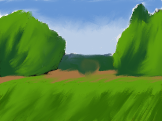
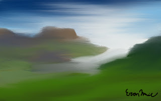
The scope of the project was to take landscape photos and make them look like paintings using the brush tools. My original was of some mountains by a river delta. Since I was having trouble getting the paintings to look exactly like the original, I decided to have some fun with it and make it look like a watercolor. Something I would do differently next time is to spend more time figuring what I did wrong, as I asked a lot of people and looking online and couldn't find much. What I did learn was how to create preset brushes and using the wet and dry to create and mix colors. Something I would do the same is color choice. Overall, I learned quite a bit from this project but I wish I could figure out what I am doing wrong on certain things.
Tuesday, December 8, 2015
Clipping Masks
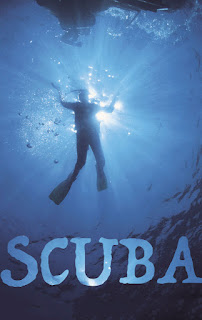
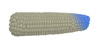

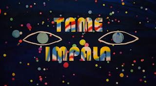
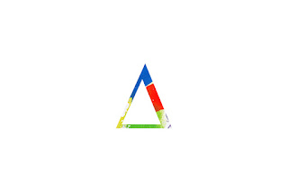
The scope of the masks project was to understand how masks work in Photoshop, how to appropriately use them, and then to be able to use pur creativity with the concept. For my original, I decided to do a clipping mask postcard based on Tame Impala, one of my favorite bands, and Alt-J, one of the bands to got me into music. I used artwork from the bands and went through many typefaces in order to find ones that fit the band's style. Through this project I learned how masks can be used for a variety of different things, and the techinical aspect of applying an image to the mask. Something I would to do differently would be to explore the other different kinds of masks. Something I would do the same would be to come up with ideas that relate to me more as a person. All and all, I had fun with this concept and still have more ideas on what to do with it, such as using shapes and constrasting images.
Sunday, December 6, 2015
Professional Article Review
This article is about the essentialness of creative anarchy, and while breaking the roles is important, understanding those rules is necessary in order to break them. Creative anarchy, as the article states, is about knowing the boundaries of design, and knowing when it is necessary to stretch those boundaries. The article argues that creative anarchy is important during all graphic design projects, but the importance varies depending on the project. The author supports this argument by explaining how rules are simply guidelines, and by bending these guidelines at the right level and in the right way, the more effective your design can be, with examples such as the Candie's shoe ad. The strengths of the article is that it makes it points concise and clear and shows clearly how to bend the rules, but its weaknesses are that it is not clear on what the rules actually are, and there is not much evidence used. I felt that if the actual rules were addressed, the idea would come across better without major questions. As for the evidence, the lack thereof muddies up the supports of the argument. The argument itself, however, is well construed as well as the process, making clear when it is appropriate to stretch the boundaries. Overall, it delivers the message well but I feel it doesn't back it up well.
Subscribe to:
Comments (Atom)


